How to Design Campaign Signs That Get Noticed

Design decisions shape how voters notice and remember a candidate long before they read a full message. To design campaign signs that work in real conditions, campaigns must think beyond looks and focus on speed, clarity, and visibility.
Yard signs often receive only a brief glance from passing drivers or pedestrians, which makes layout and contrast far more important than creative flair. Strong sign design turns limited viewing time into instant recognition and lasting recall.
Why Sign Design Matters in Political Campaigns
Campaign signs operate in uncontrolled environments. Traffic speed, lighting, weather, and visual clutter all affect how a message lands. A strong design accounts for these factors and delivers a message in seconds. When a sign looks clean and readable, it reinforces credibility and familiarity. Poor design leads to confusion or missed opportunities, no matter how good the message may be.
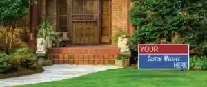
Color Contrast Drives Visibility
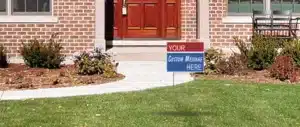
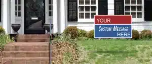
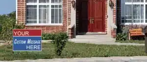
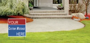
Color contrast plays a major role in how quickly a sign becomes readable. High-contrast combinations like blue with white, red with white, or yellow with black help text stand out from a distance. Low-contrast designs fade into surroundings, especially in neighborhoods filled with trees, fences, and buildings.
Campaigns benefit from choosing one dominant background color paired with a clear text color. Consistency across all signs helps voters recognize the campaign without effort. When colors stay uniform, name recognition builds faster across different locations.
Text Must Stay Simple and Direct
Campaign signs work best with limited text. A candidate’s name should appear largest, followed by the office sought and a short slogan if space allows. Too many words reduce readability and force viewers to spend more time than they have.
Simple layouts support faster understanding. Drivers and pedestrians should grasp the message almost instantly. When a sign feels crowded, the message weakens.
Font Choice Shapes Readability
Font selection affects how easily text reads from a distance. Bold, clean fonts like Arial, Helvetica, or similar styles perform well on yard signs. Decorative or script fonts reduce legibility and distract from the message.
Thicker strokes improve visibility in outdoor conditions. Thin fonts disappear under glare or shadow. Campaigns that use strong fonts gain clarity without increasing sign size or cost.
Information Hierarchy Guides the Eye
Effective sign design follows a clear visual order. The candidate’s name takes priority, followed by the office or role. Secondary details should never compete for attention. When hierarchy stays clear, the eye moves naturally across the sign.
Logos or symbols may support recognition, but they should never overpower the main text. Balance keeps the message focused and prevents confusion.
Images and Symbols Should Stay Minimal
Photos and symbols work best when they serve a purpose. A professional headshot or simple logo can help humanize a campaign, but only when space allows. Overuse of imagery often weakens the message and reduces contrast.
Many campaigns choose text-only signs for roadside use and reserve imagery for larger formats or event signage. This approach keeps messages readable under fast viewing conditions.
Sign Size and Material Influence Results
Size affects how far a sign can communicate. Smaller signs fit well in residential areas and work best when placed closer to viewers. Larger formats support roadside placement and higher speeds. Campaigns often mix sizes to match different environments.
Durable materials matter for outdoor use. Corrugated plastic remains a popular choice because it handles weather while staying lightweight. Campaigns that use custom corrugated plastic signs gain flexibility in size, layout, and long-term use without sacrificing clarity.
Budget-conscious campaigns often rely on cheap yard signs to spread their message across many locations. Quantity paired with solid design often outperforms fewer signs with complex layouts.
Placement Strategy Shapes Design Choices
Design and placement work together. Signs placed near intersections face different viewing angles than signs on private lawns. Taller grass, fences, and parked cars also affect visibility.
Local rules often limit placement height or size. Campaigns that design within common standards avoid issues and keep signs visible longer. Checking regulations early helps avoid wasted time and resources.
The Three-Second Test
A well-designed campaign sign communicates its message within three seconds. If a viewer needs more time, the design asks too much. This test helps campaigns simplify layouts and focus on what matters most.
Design teams benefit from stepping back and viewing signs from a distance. If the name and message remain clear, the design works.
How PoliticalLawnSigns.com Helps Campaigns Design Signs That Work
At PoliticalLawnSigns.com, we manufacture campaign signage in the USA and help candidates turn smart design choices into effective signs. Our team understands how layout, size, and material affect visibility in real settings. When campaigns need guidance on formats or production options, we stay responsive and practical.
For clear direction and reliable results, contact us and let us help bring your campaign message to life.