What Are The Best Fonts For Political Signs?
As campaign season heats up, streets are filled with lawn signs displaying names, slogans, and vibrant colors. Amid the sea of signs, some stand out immediately, while others blend in. Often, the difference comes down to something many people overlook: fonts. A candidate’s font choice acts as an introduction, a handshake, and sometimes even a statement of values.
Political branding experts, like Northeastern professor Katherine Haenschen, have studied this connection in detail. Her research on over 900 campaign logos revealed that typefaces help shape voter impressions long before a candidate speaks. Serif fonts often reflect tradition and reliability.
Sans-serif fonts lean modern and forward-looking. Script fonts can feel approachable, but also risk readability at a distance. These design decisions may look subtle, yet they carry weight when every passing glance counts.
In an election, a political sign has seconds to leave an impression on a driver speeding past or a neighbor walking by. That moment of recognition may not win a vote outright. Still, it builds familiarity, and in politics, familiarity matters.
Fonts For Political Signs And Their Impact On Campaign Identity
The fonts for political signs are never random picks from a drop-down menu. Designers weigh party identity, candidate personality, and even gender dynamics when making choices. Haenschen’s study showed apparent differences.
Republican candidates often leaned toward serif fonts, which conveyed stability and tradition, while Democratic candidates embraced sans-serif fonts that looked modern and clean. Incumbents were more likely to stick with older serif-based logos from previous cycles, which sometimes made them feel out of step with current design trends. Female candidates used script or handwriting fonts more often to project warmth and accessibility.
These choices highlight how typography communicates beyond words. The font on a yard sign speaks even before the message is read. It tells voters whether a campaign feels current, dependable, bold, or friendly.
Design firms spend considerable time testing how fonts appear in various settings, whether in all caps, lowercase, with first names, or last names. Each decision builds the candidate’s brand, which voters carry with them when they head to the polls.
Why Font Choice Can Make or Break Sign Visibility
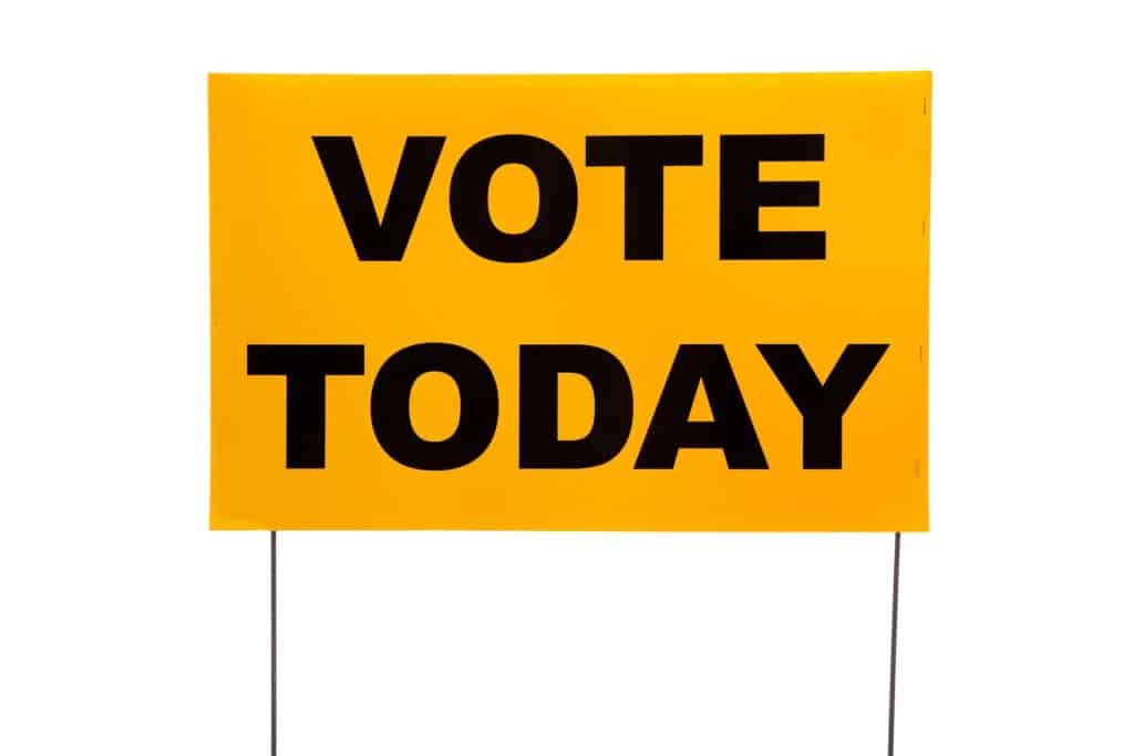
Campaign signs live in crowded environments where competition is fierce. Dozens of yard signs can sit side by side at a busy intersection, and only the strongest designs will register with passersby. Fonts that are too ornate or thin will disappear. Fonts that are too playful may not project credibility.
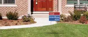
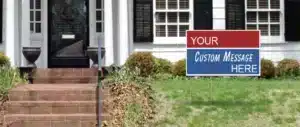
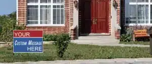
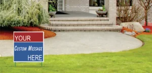
The right font must strike a balance between impact and legibility. It should also work in every context, from a tiny lapel sticker to a 22×28-inch fold-over sign displayed on a lawn.
Designers often prefer sans serif families like Gotham, Helvetica, or Montserrat because their geometric clarity holds up at a distance. Franklin Gothic, bold and authoritative, works well in uppercase treatments that demand attention.
Open Sans and Proxima Nova offer approachable but modern looks that feel fresh on both print and digital platforms. These choices stand out because they perform reliably in real-world conditions, not just on a computer screen.
Bringing Research into Real-World Campaign Materials
While it is fascinating to explore the theory behind fonts, campaigns must apply these lessons to the practical realities of printing. A typeface must reproduce cleanly on corrugated plastic, cardboard, or vinyl without any noticeable artifacts. It should withstand outdoor exposure without losing clarity.
It should also look strong on both a mailer in someone’s hand and a sign viewed from across the street. That is why our team at PoliticalLawnSigns.com advises campaigns to test designs in real contexts before committing. What looks perfect on a computer may not hold up once it is scaled, printed, and staked into the ground.
Our 12×18 Cheap Plastic Corrugated Political Campaign Yard Signs offer an ideal format for simple, bold fonts that voters can absorb at a glance. Need larger displays? Our 22 x 28 Fold Over Cheap Poly Coated Cardboard Yard Signs give campaigns the space to make a statement without sacrificing readability.
In every case, the font becomes the anchor that carries the candidate’s name into public spaces again and again.
The Font Is Part of the Message
Political campaigns are built on repetition and recognition. A sign that fails to be read fails to do its job, no matter how clever the slogan or bold the colors. The right font can give a strong presence in a crowded place, while the wrong font can fade into the background.
At PoliticalLawnSigns.com, we have supported candidates from local school board races to statewide contests. If you are planning your next campaign, let us help you find the right materials, the right sizes, and the right designs to carry your message forward.
Connect with us today, and let’s create signs together.