Successful Political Yard Sign
Design Color Tips
Sheila Maas

PoliticalLawnSigns – Yard Sign Design Color Tips often spark debate. Henry Ford said you can have any color Model T as long as it is black. A while back, a University of Florida survey claimed that a yellow background with black lettering was the most effective for attracting attention. In the packaging industry, red is the favored attention-getting color down the supermarket aisle. So there you have it! The experts agree to disagree.
So what color is best for your Political Campaign Yard Sign? Answer: Take your pick as to what suits ‘You’ best. Obviously, avoiding picking your opponent’s colors, here are some other helpful Yard Sign Design Color Tips as to what not to do.
Consider Color Value
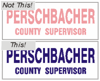
Never use a low-value color (light color) with a low-value color. For example, pink (low value) lettering on a white (low value) background will not show up.
All pastels (e.g., pale blue, yellow, pink, light green) will not contrast against white backgrounds. Interestingl,y fluorescents, though appearing very bright, will not contrast on white. Choose a dark (high value) color (e.g,. black, navy blue, burgundy, red, forest green)
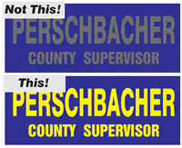
Similarly, never use a high value (dark) color with a high value (bright) color. For example, black lettering on a navy blue background will not show up. Yellow lettering here would certainly be more effective.
Lettering and background must always be of contrasting value to be readable.
Consider Environment
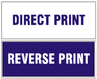
First, remember, white is the principal base stock color – and it is free. Blue (or, for that matter, red, green, orange, etc.) lettering on a white background is a one-color print. So also is white lettering with a blue background a one-color print. The blue is printed as what is referred to as “reverse printing”.
For Northerners, avoid white signs in winter. To not have your political sign “lost” against the white snow, use reverse printing (i.e., bright colored printed background with white letters). Similarly, green backgrounds can get lost in more lush territories and/or seasons, as yellow signs can against arid backgrounds. For a sign to be recognized, it has to be a color that is “out of place” in its environment. Avoid khakis, gray, and brown background colors for that reason. For standard ink colors, consult a screen printer’s ink colors galleries.
Two Colors vs. One Color
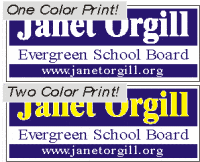
There has never been a one-color design on a campaign sign that cannot be improved by adding a second color. Again, white, as a base stock color, is free. Two-color printing to produce a yellow/blue sign will always stand out with greater impact.
For the printer, two colors require two films, two screens, two setups, two runs, and two cleanups. This costs money. So for a two-color sign, always expect to pay more per sign – but it may be worth it.
Full Color Process
No matter the size sign, a Full Color Process design gets the most attention. The availability of Digital Printers up to 4’x8’ replicates multi-color designs in eye-catching reproductions. Many templates are available for layout ideas to assist in creating a full-color design for your campaign.
Hopefully, these suggestions will aid in your design decisions for all campaign items: stickers, posters, yard signs, lawn signs, and road and highway signs. For a wide range of ideas, it is helpful to consult design ideas galleries on a digital printer’s website. If you have questions, do not hesitate to consult directly with your printer – they have the expertise to help.