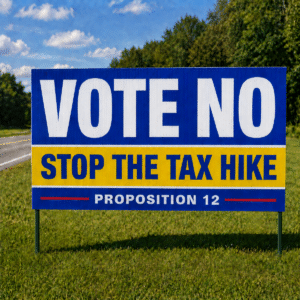
Should You Add Images On Your Political Yard Signs?
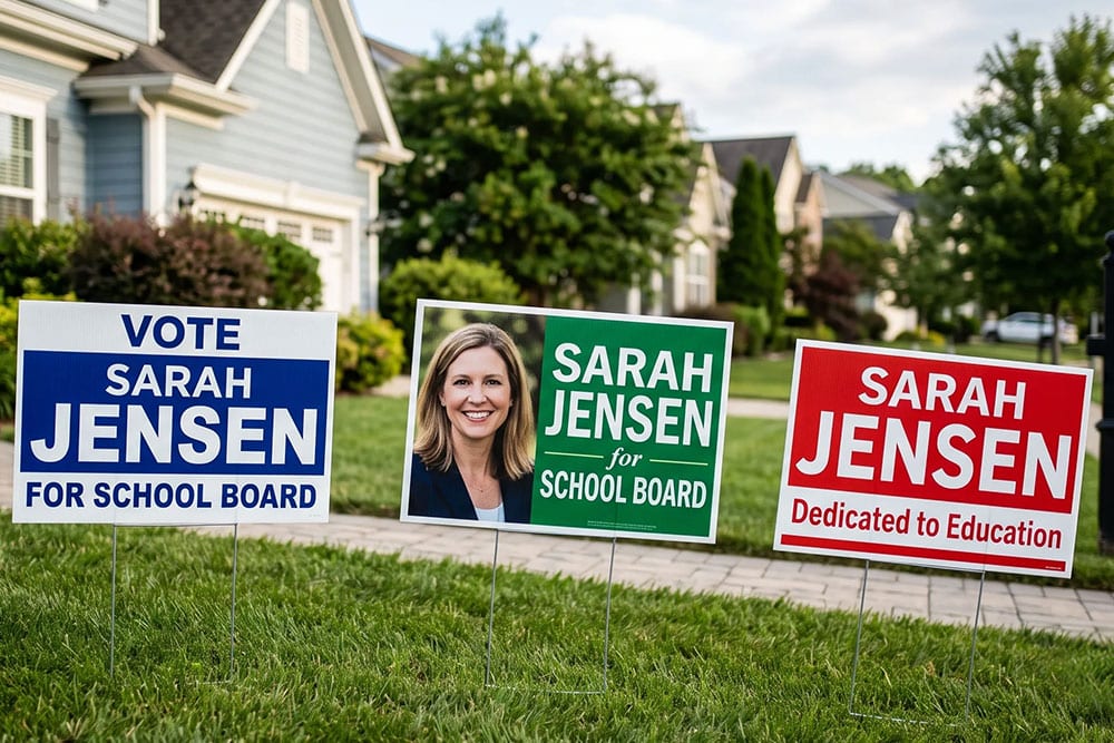
Quick Summary
Images on political signs work best when the sign is large enough to accommodate them or when viewers see the sign from relatively close range. On smaller lawn signs, a bold candidate name paired with a simple icon or logo usually makes the name easier to remember than a headshot. Photos require digital full-color printing, high-resolution files, and permission from the photographer. Keeping the candidate’s name as the largest element preserves readability, while a photo may look dated on corrugated signs designed to last two to three years.
A smiling headshot can make a campaign sign feel more personal, while a logo or flag can give the design a simple way to stand out along a crowded street. But should you add images to political signs?
The answer depends on where the sign will be displayed, how large it is, and what you want voters to remember after passing it. A sign has only a few seconds to communicate its message, so every visual element competes for that limited attention.
Should You Add Images On Political Signs? What Decides the Answer
Images can benefit a campaign in certain situations, but they can also compete with the information voters need to see. Three factors usually determine the right choice: sign size, the distance and speed at which people view the sign, and the purpose of the image.
A small lawn sign on a quiet residential street has limited space, so adding a photo may require shrinking the candidate’s name. Larger formats give an image more room to register without crowding the text.
Standard yard signs generally work best when the candidate’s name leads the design. People passing a sign need to connect a name with a candidate, and that same name will appear on the ballot. A face can build familiarity, but the ballot typically lists names rather than photographs. Any image should therefore reinforce name recognition instead of competing with the candidate’s name.
How Viewing Distance Affects Image Choices
Photos that look sharp up close can turn into an unrecognizable blur from the street. Facial features need enough space to read at a distance, and small details like eyes or a smile fade quickly. On 18×24 political campaign yard signs, a headshot would need to cover a large share of the surface to stay recognizable, leaving little room for the name and office.
Square formats like 24×24 political campaign yard signs offer a bit more flexibility, especially for a simple logo or icon placed beside the name. Still, a useful rule of thumb holds: the faster the traffic and the smaller the sign, the simpler the design should be. Pedestrian areas near schools, parks, and downtown sidewalks give people more time to look, which makes small graphics more practical in those spots.
When a Candidate Photo Can Work
A headshot can make sense in certain campaign settings. Candidates who are new to politics may benefit from connecting a face with a name, particularly in small communities where residents may already know one another through local organizations, schools, events, or businesses. The important consideration is giving the photo enough space to remain recognizable.
- Large road signs: 4×4 large political road signs and 4×8 large political road signs offer enough surface area for a clear headshot beside a bold name.
- Close viewing spots: Signs at rallies, event tables, and campaign offices are seen from a few feet away, where facial detail holds up well.
- Name recognition efforts: A first-time candidate facing a well-known incumbent may use a face to help voters remember a newcomer.
- Consistent branding: A photo that matches mailers, palm cards, and social media helps voters connect the pieces of the campaign.
Outside of these cases, a photo on a small lawn sign often takes up more space than it gives back in recognition.
Simple Graphics That Often Work Better
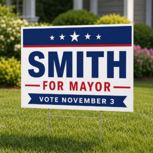
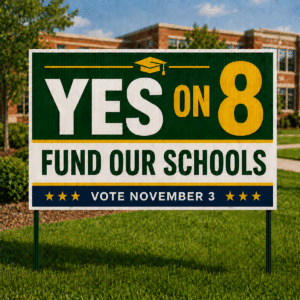
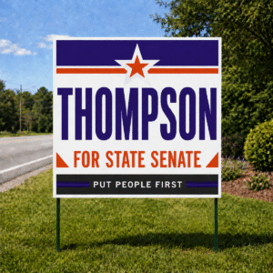
Icons, symbols, and small design elements can give a campaign sign personality without crowding the candidate’s name. A star, waving flag, checkmark, or simple outline of a state or county can add visual interest while framing the text.
These elements remain easier to recognize from a distance because they rely on bold shapes and solid colors rather than fine details. A campaign logo can serve a similar purpose, especially when the candidate’s name is its main visual feature.
Keep graphics secondary to the text by placing them in a corner, along a border, or as a small accent beside the candidate’s name. Stripes and color blocks can add energy without making the layout feel crowded.
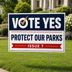
A simple checkbox next to the name can reinforce the voting message while taking up very little space. The most effective graphic choices are those a driver can understand in one glance without needing to stop and study the sign.
Matching Images to Your Campaign Message
An image should reinforce the message a campaign wants its signage to communicate. A candidate focused on public safety might use a simple shield shape, while a school board candidate could incorporate a clean apple or book icon. Local landmarks, such as a water tower or covered bridge, can also signal local connections to residents who recognize them.
Keep these visual choices simple because a detailed landmark illustration can lose its meaning at a distance. Consistency across campaign materials matters as well. Using the same graphic on lawn signs, road signs, door hangers, and mailers can help voters associate those materials with the same campaign.
How Images Affect Printing Method and Cost
The printing method affects the types of images a campaign can use. Screen printing uses one or more solid ink colors, making it suitable for bold text, simple icons, and flat logos. Photographs require digital full-color printing to reproduce skin tones, shading, and other details. Digital printing handles a broad range of colors and produces sharp results for photos, gradients, and detailed artwork.
Designs using one or two ink colors can cost less to produce, so simpler graphics may help a campaign stretch its printing budget. Material also becomes important when a photo is part of the design. Poly-coated cardboard is a lower-cost option that lasts about six to eight weeks outdoors, which makes it suitable for a short race. Corrugated plastic costs slightly more but can last two to three years.
Campaigns considering sign reuse in a future race should also think about how a headshot will age. A photo taken for the current campaign may look dated at the next election, while a text-based design with a logo can remain relevant for much longer.
Practical and Legal Points to Check Before Adding Images
Images bring a few extra considerations that text alone avoids. Photo ownership comes first. A professional headshot usually belongs to the photographer, so get written permission to use it on printed campaign materials. Logos from endorsing groups, businesses, or unions may also need approval before they appear on your signs. Official government seals and insignia can carry legal restrictions in some jurisdictions, so check local rules before placing them on campaign materials.
Image quality matters just as much. A photo pulled from social media or a phone screenshot usually lacks the resolution to print cleanly at yard-sign size, and it can turn blurry or pixelated when enlarged. High-resolution files from a professional shoot give the best results. Finally, remember that required disclaimers such as a “Paid for by” line need their own space. An image that fills the layout can leave that text cramped or hard to find.
Design Tips If You Decide to Include an Image
A thoughtful layout lets an image add value without taking over the sign. These guidelines help keep the name front and center:
- Size balance: Keep the candidate’s name as the largest element on the sign, with any image playing a secondary role.
- Clean background: Choose a headshot with a plain or blurred background so the face stands out from a distance.
- Tight cropping: Crop close to the head and shoulders to make the face easier to recognize.
- Color harmony: Match the image colors to your campaign palette so the sign looks unified.
- Placement: Position images to one side of the name instead of behind it, which keeps the text easy to read.
- Test view: Print a small mockup and look at it from across a room or parking lot before approving the final design.
Letting Your Name Lead the Design
Images can add warmth and personality to campaign signage when the sign size, viewing distance, and printing method line up in their favor. On smaller lawn signs, a bold name and a simple graphic usually drive recall more than a photo squeezed into a corner. Larger road signs, event displays, and close viewing spots give a headshot the room it needs to make an impression.
Whatever direction you choose, the goal stays the same: help voters remember your name at the ballot box. At PoliticalLawnSigns.com, our customer service team talks with candidates about these design choices throughout election season. Unsure how an image will look on your signs? Share your design ideas with our team, and we can help you decide what belongs on the final layout.
FAQs
Can I use a family photo on a campaign sign?
Family photos add several faces to a small space, so each one becomes harder to recognize from the road. These images usually fit better on mailers, websites, and social media, and it helps to get consent from every adult pictured before printing.
What file type works best for a campaign logo?
Vector files such as AI, EPS, or PDF can scale to large sign sizes without losing sharpness. A JPG or PNG can still work if the file has enough resolution at the full printed size.
Do images add time to the printing process?
Designs with photos may need an extra round of proofing to check color, cropping, and placement. Building in a few days for revisions helps keep your order on schedule if changes come up.