Political Sign Design Tips That Actually Win Votes
Quick Summary
Candidate name and office are the only fundamentals on a political yard sign; everything else risks shrinking the name and reducing readability at speed. Sans-serif fonts, high-contrast color pairings, and a clean layout with visual hierarchy do most of the heavy lifting.
Skipping election dates extends sign reuse across cycles, and testing the design at a distance before ordering prevents costly mistakes in the field. Consistent branding across all campaign materials compounds name recognition over time.
A yard sign has about three seconds to make an impression before a driver passes it. At PoliticalLawnSigns.com , campaigns from all 50 states have shown how strong design can separate a memorable sign from one that disappears into the background.
The best political sign design tips focus on making signs readable, memorable, and easy to process at a glance.
Political Sign Design Tips That Start With the Copy
Before choosing colors or layouts, finalize the wording first. The most important rule is simple: include the candidate’s name and the office being sought. Those are the only pieces of information a sign truly needs. Most additional text becomes clutter.
The fewer words on a sign, the larger the candidate’s name can be. A larger name means more readability from further away. Campaigns regularly undermine their own signs by adding slogans, websites, phone numbers, and taglines that shrink the name down to a size no passing driver can absorb in time.
A few specific copy decisions worth making early:
- Skip the election date: A sign without a date can be stored and reused in future races or early voting periods. Adding a date locks the sign to one cycle.
- Drop “vote for” and “elect”: Both phrases are redundant on a campaign sign. Voters know what a yard sign means.
- Use “Re-Elect” if you are an incumbent: One word signals experience and a track record without requiring any additional space.
- Leave the website off the smaller signs: A URL shrinks the name. Save the website for palm cards and door hangers, where the voter has time to read it.
Our political campaign resources cover additional guidance on campaign materials that complement your sign strategy across the full campaign season.
Typography and Color: Where Signs Win or Lose
Font selection comes down to one question: can a driver read it at 30 miles per hour? Sans-serif fonts such as Gotham, Helvetica, and Montserrat remain readable at larger sizes because their clean lines hold up from a distance.
Decorative lettering, script fonts, and thin typefaces usually fail in real roadside conditions. Stick with one or two typefaces at most. Anything more creates unnecessary visual noise.
Letter height determines readability distance. As a rule of thumb, one inch of letter height gives roughly 10 feet of viewing distance. Letters smaller than three inches on a standard 12×18 yard sign will struggle at roadside placements, especially in competitive areas where multiple signs compete for attention.
Color follows the same principle of readability over aesthetics. High-contrast pairings are non-negotiable. Dark text on a light background or light text on a dark background: navy and white, red and white, black and yellow. Avoid pairing light colors together.
Pink on white, any pastel on white, or fluorescents on white backgrounds will all disappear. Equally, pairing two dark colors like black and navy creates the same problem. The lettering and background must always sit at opposite ends of the value scale to be legible.
Layout and Visual Hierarchy
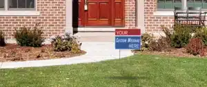
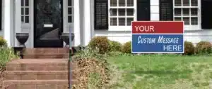
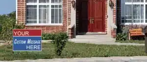
The candidate’s name should dominate the sign visually. It needs to be the largest element on the layout and should occupy most of the available space. The office title belongs underneath in a smaller size. A thin border around the copy can help separate the text from the background without adding extra complexity or cost.
Photos rarely work well on smaller yard signs. Headshots often reproduce poorly at standard sign sizes and compete with the candidate’s name for attention. One simple logo or graphic can work effectively, but multiple images divide the viewer’s attention during the short moment they have to process the sign.
Before You Order, Test the Design
Print the design on a standard sheet of paper and step back at different distances. Check whether the name is still readable from ten feet, then twenty. If it starts to blur or compress at close range, it will not hold up in the field on a roadside placement.
Campaign packages that bundle different sign sizes let campaigns test visibility across multiple placement types without committing the entire budget to one format before knowing how the design performs.
Keeping branding consistent across all materials (signs, palm cards, stickers, digital ads) builds cumulative name recognition over time. A voter who sees the same name and color scheme repeatedly across different contexts is far more likely to remember it on election day.
Ready to Put a Better Sign in the Field
Early design decisions save money and improve results. A well-designed sign, ordered in the right quantities and deployed strategically, outperforms a poorly designed one, regardless of how many are ordered. If you want to talk through your design, sizing, and material options before your order goes in, contact our team.
FAQs
Should a candidate’s photo be included on yard signs?
Photos are usually not recommended for smaller yard signs. They reduce the available space for the candidate’s name and often reproduce poorly at standard dimensions. Headshots work better on larger roadside signs or printed materials like palm cards, where voters have more time to engage with the design.
How many colors should a yard sign use?
One or two colors remains the standard approach for readability and cost efficiency. High-contrast combinations such as navy and white or red and white outperform multi-color layouts in roadside visibility. Full-color printing can help signs stand out in crowded political environments where many campaigns rely on similar patriotic color palettes.
Does font size matter more than font style?
Both matter, but size has a more immediate impact on field performance. A large, bold sans-serif font in an adequate size will outperform a stylish but smaller font at roadside placements. Prioritize making the candidate’s name as large as the sign allows before refining the font choice.