Tips For A Successful Political Lawn Sign
Design Layout
Sheila Maas
PoliticalLawnSigns.com – The appearance of political yard signs and candidates’ road signs before an election is as predictable as clouds before the rain.
There must be a reason for this “American as apple pie” phenomenon. The reason is simply that political signs have proven themselves as an effective way for candidates or causes to promote their image or position – and win!
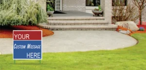
Not all political signs are effective, and some campaign poster layouts could just as well have spared the candidate his/her money and the committee’s time. Though designing an effective sign is not rocket science, failure to pay attention to some basics could fail to get your campaign “off the ground”.
Over 65 years of printing has given Cross & Oberlie a wealth of experience in sign layout and how to make campaign signs. Presented here are sign design tips and sign layout ideas to keep in mind as you embark on the process of how to make political signs to win a successful political campaign.
(1) Importantly, consider The Who (your name) and The What (the office you are running for).
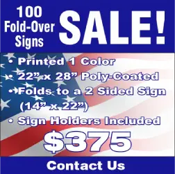
The Who – The length of your name must be considered. POE and VANDENLANGENBERG present different sign design considerations. Suppliers of the cheaper plastic cardboard double-sided fold-over yard sign can accommodate both – a PORTRAIT Layout (22″wide X 14″ tall) for short names, and a LANDSCAPE Layout (28″wide X 11″ tall) for long names. Both orientations present the same print area at no penalty in cost or weatherability.
If your name is common, like SMITH, it may be well not to design just a last name yard sign but to include your first name, JOHN or JOAN, in your design to distinguish and avoid confusion with other Smiths (office holders, relatives, spouses, rogues, etc.) who may or may not be running. First names need not be in the same font (letter) size or style as the surname, as this may detract from the surname.
The What – The office position you intend to hold after the election is important. Make certain it shows as a recognizable position and as it would appear on the ballot. As you are only putting signs in your district, it can be advantageous to eliminate extraneous references and specific numbers (e.g., simply CONGRESS versus 16th UNITED STATES CONGRESSIONAL DISTRICT). Use abbreviations sparingly – preferably not at all. Font size for the office should be subordinate to the font size.
For choices of effective fonts for signs, consult a printer’s sign fonts gallery.
(2) Extras – If you are a candidate being re-elected, inclusion of RE-ELECT can be a plus as it distinguishes you as the incumbent. Words like VOTE and FOR are used with caution as they are not necessary and can detract from your principal mission – presenting The Who and The What.
(3) Slogan – A slogan is great for signs placed at stop lights, but most viewers of lawn signs are zipping by at 30-plus miles per hour with little time to read what you stand for.
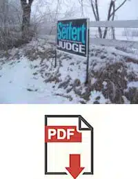
(4) Symbols – In this age of icons, who can not recognize the appropriateness and symbolism of a school house (SCHOOL BOARD) or a five- pointed star (SHERIFF), a balance scale (JUDGE), a donkey (DEMOCRAT), an elephant (REPUBLICAN), a statue of liberty (LIBERTARIAN) or of flags or stars and stripes. These can help.
(5) Disclaimer – Last, but most important, don’t forget your “Authorized and Paid for…” or whatever the exact wording and size, and position is as dictated by your local and/or state election boards. It is the candidate’s responsibility to find out the regulations and make this known to the printer.
Today in the “flat world,” your sign printer does not need to be next door, but can be just as close as your Smartphone, laptop, or desktop console. With computer technology, successful designs are not just for the deep-pocket candidates. Try on sign design styles that suit your image – then run to Win!
Check out these other resources:
- Tips for Successful Political Lawn Signs – Design Layout
- Tips for Successful Political Lawn Signs – Design Color
- Tips for Erecting Signs – 4×8 Corrugated Sign
- Tips for Successful Political Yard Signs – Type of Sign
- Tips for Successful Political Lawn Signs – Unique Design Ideas for Fold-Over Signs
- DESIGNS Galleries
- FONTS Gallery
- INK COLORS Gallery